
The Problem: Bar Gauge Limitations with Dynamic Limits / Thresholds
Some days ago I was struggling with creating a bar gauge in Grafana with custom thresholds for visualizing Kubernetes resource usage. My main use case was having a clear way to list all pods in a given namespace and compare the Kubernetes resource requests/limits to the current usage in a visually intuitive way.
The core problem I encountered was that bar gauges don’t allow you to set query results as panel thresholds - threshold values must be static. To be more precise, you can apply the “Configs from Query Results” transformation, but that will apply a single value to all panels, instead of allowing you to set different values for each metric in the same panel.
I found my own solution and, since I couldn’t find any similar solution in the internet, I decided to share it here.
The Solution: Bar Chart with Stacked Visualization
Here’s the trick I discovered: use a bar chart instead of a bar gauge and leverage the stacked bar chart functionality with two queries in Table format.
Visualization Options
I implemented two different visualizations that might be useful for you:
Option 1: Stacked Bar Chart
The stacked approach provides the clearest visual comparison by showing both the actual usage and the remaining capacity in a single bar.
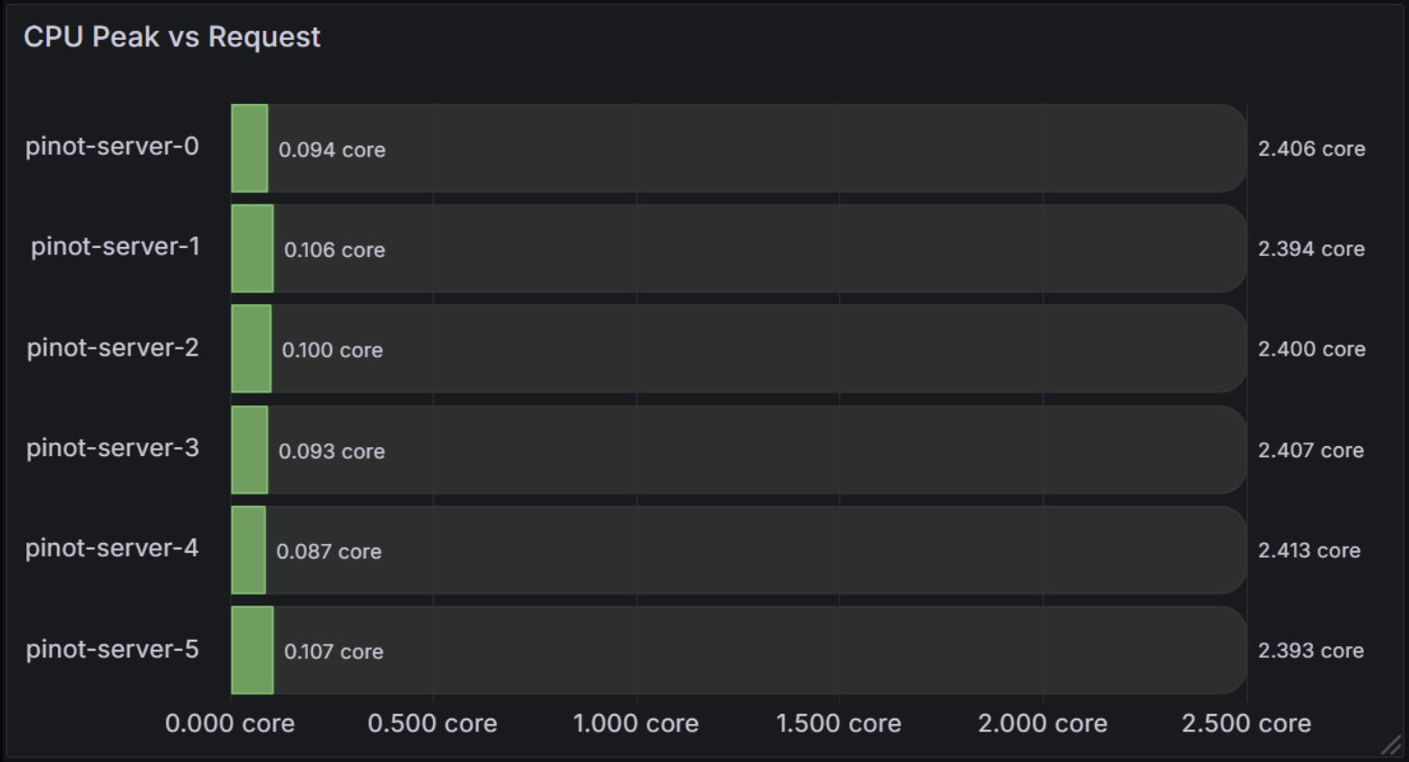
This visualization shows:
- Green segments: Peak CPU usage for each pod
- Dark gray segments: Remaining CPU capacity up to the requested limit
- Total bar length: Represents the pod’s CPU request
For the stacked bar chart approach, you need two queries configured in Table format:
Query 1: Current/Peak Usage
max_over_time(
   sum by(pod) (
      rate(
         container_cpu_user_seconds_total{
            cluster_name="my-cluster",
            pod=~"pinot-.+",
            container!="",
            container!="POD"
         }[5m]
      )[$__range:]
   )
)
Query 2: Remaining Capacity
min by(pod) (
   kube_pod_container_resource_requests{
      cluster_name="my-cluster",
      pod=~"pinot-.+",
      resource="cpu"
   }
   -
   max_over_time(
      sum by(pod) (rate(container_cpu_user_seconds_total{cluster_name="my-cluster", pod=~"pinot-.+", container!="", container!="POD"}[5m]))[$__range:]
   )
)
Notice that the second query subtracts the peak CPU usage from the resource requests, this way we get the remaining capacity to be stacked on the bar chart.
In most recent implementations, I even added a third query to also show the current CPU usage, this way we can see the difference between the peak usage and the current usage.
Option 2: Overlaid Bar Chart
The overlaid approach shows absolute values with different metrics overlaid on the same chart.
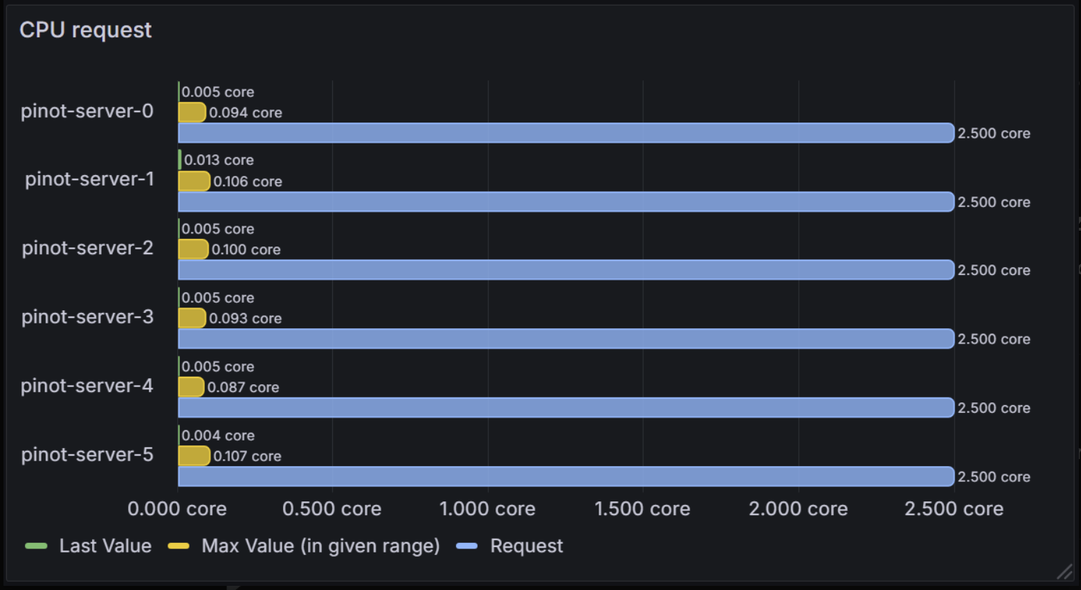
This shows:
- Green bars: Current CPU usage (Last Value)
- Yellow bars: Peak CPU usage (Max Value)
- Blue bars: CPU request (Request)
Since we use absolute values, we don’t need to subtract the peak usage from the resource requests, as we did in the stacked approach.
Implementation
Panel Configuration
Image 3: Grafana Panel Configuration
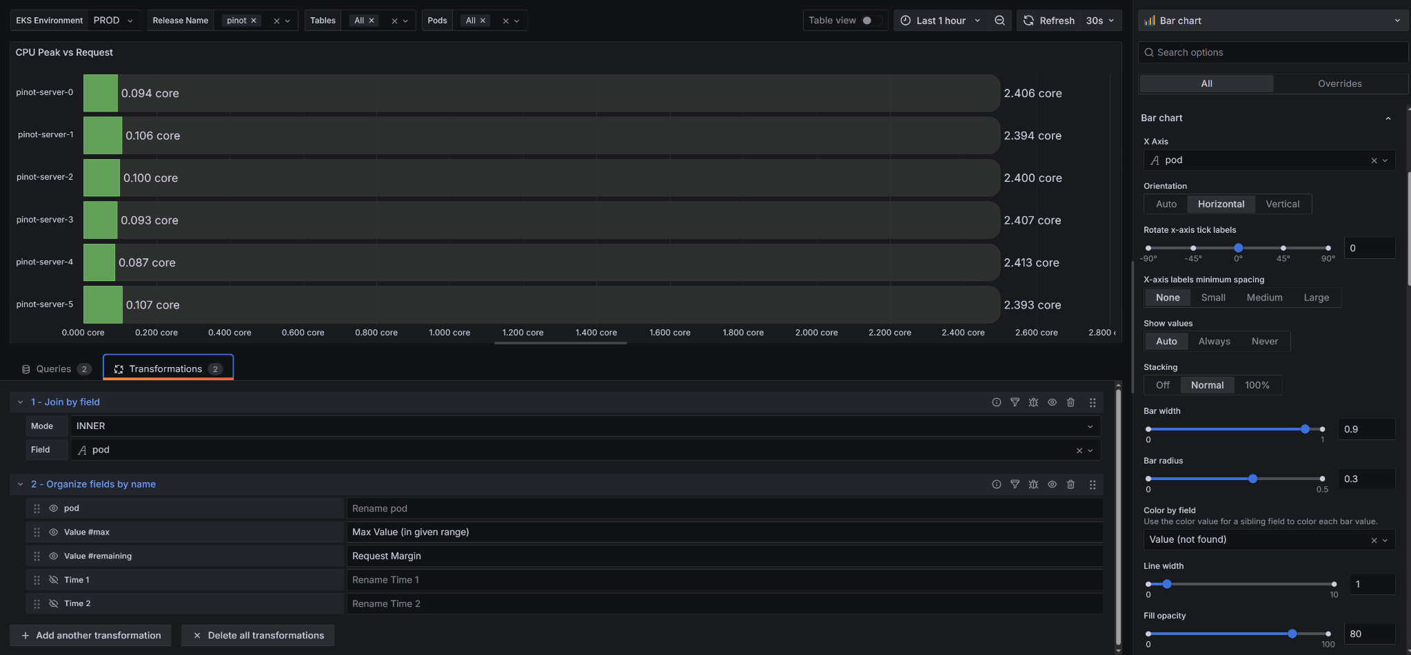
Key configuration settings:
- Panel Type: Bar chart
- Orientation: Horizontal
- Stacking: Off (for overlaid) or Normal (for stacked)
- Query Format: Table for both queries
- Transformations: Use “Join by field” and “Organize fields by name” to clean up the data
Data Transformations
The transformations are crucial for making this work:
- Join by field: Join the two/three query results to create a single table with multiple values for columns.
- Organize fields by name: Rename fields for clarity.
My Use Cases
After implementing this trick, I quickly realized why this approach was so necessary for my day-to-day operations. Here’s how it transformed my Kubernetes monitoring:
Pod Resource Optimization: The “Why” Behind Right-Sizing
I was constantly struggling with pods that were either over-provisioned (wasting money) or under-provisioned (causing performance issues). The traditional bar gauges made it impossible to see the relationship between what I was requesting and what I was actually using.
With this visualization, I could finally see the real picture. I remember looking at one of my Pinot servers and realizing it was only using 0.1 cores out of 2.4 cores requested - that’s a 95% waste! This visualization made it immediately obvious why I needed to adjust my resource requests. I was able to reduce costs significantly by right-sizing pods that were clearly over-provisioned.
Node Capacity Planning: Solving the Scheduling Mystery
The real breakthrough came when I extended this approach to my Kubernetes nodes. I was constantly getting “non-schedulable nodes” errors for my pending pods, but I had no clear way to understand why.
I created similar visualizations for my nodes showing current CPU/memory usage vs remaining available capacity. Suddenly, I could see exactly why pods couldn’t be scheduled - some nodes were at 90% capacity while others were barely used. This visualization became necessary for understanding my cluster’s resource distribution.
I also added a panel to show my nodes’ taints, which was crucial for debugging why certain pods couldn’t be scheduled on specific nodes. The combination of resource availability and taint information gave me the complete picture I needed.
Comments
Comments are powered by GitHub Issues. If you have a GitHub account, you can leave a comment below!